The magic of colored backgrounds


There is a huge amount of color potential hidden in backgrounds. We usually think of shapes and the colors that go with them in a “positive” way: shapes are known as the positive space (when filled with black or darker colors) while the background—the area around the positive space—is called the negative space (usually filled in white).
The relationship between positive/negative space, shape/ground, or dark/light almost always guides our initial approach to creating—a white notebook and a black pen, a blank page in Word and black letters, a white wall and a colorful graffiti.
It isn't much different with embroidery. Most pieces are stitched on lighter fabrics (like white, ecru, beige) with motifs displaying a rich array of colors because, besides being the default mode, tracing designs on darker colors can be a real pain and stitching on dark backgrounds can be hard on the eyes.
But by doing so you're missing the great benefit of using colored backgrounds (I refer to them as “active backgrounds” in my book Colour Confident Stitching). A printed or colored fabric can push any design (any! as simple as it may be) to a new level of boldness. Colors are powerful and they are capable of integrating the motif to the whole surface.
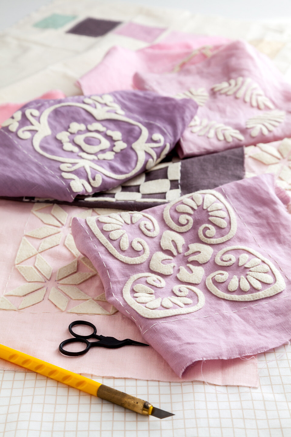
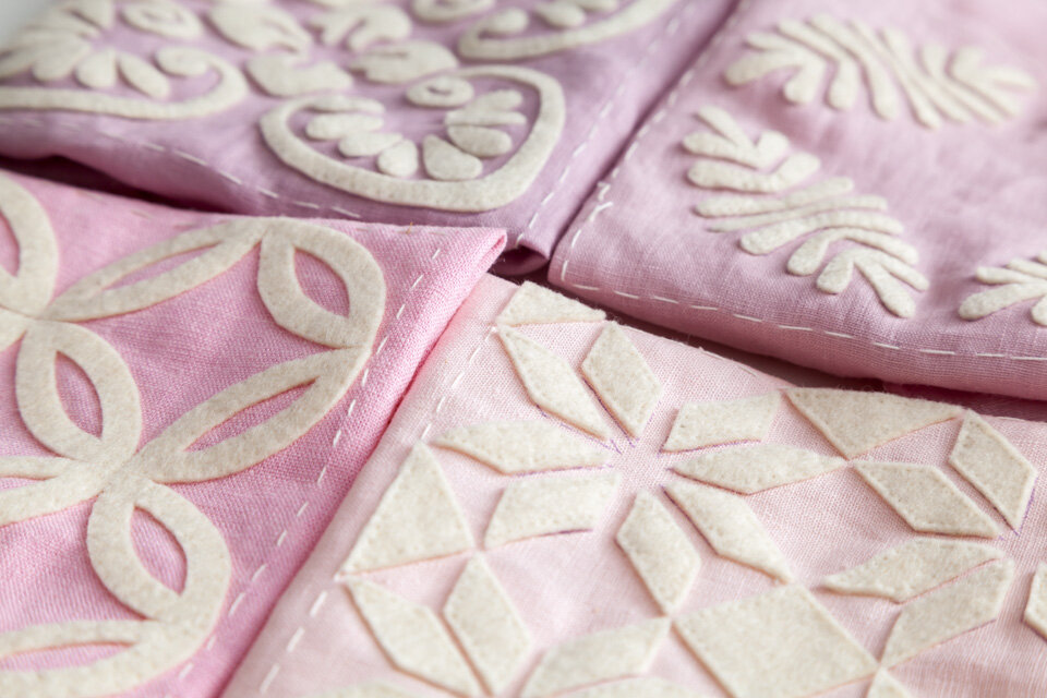
When I was planning this felt appliqué project, I decided to go for an active background because I wanted a different appearance from the design that inspired it (can you recognize some of the motifs from the original design?). For the fabrics I chose light colors (except for the brown) that offered enough contrast between the appliqués and the background to create a bold look but that still retained a soft feel to it.
Are you still with me? Too many positive, negative, active, passive things? I know this can sound quite abstract. But, can you imagine how this project would have looked like if I'd chosen a passive background? All nine squares would be in winter white linen (imagine a similar color to the appliqués) and each motif would be cut out in the pink shades shown in the color key (see right, second image). The balance of colors in this case would appear a bit bland to my taste...
With this I'm not saying that using active backgrounds is the way to go or that they're a proven color formula. They might not always work with the mood we are hoping to create. I'm just pointing out this new dimension hidden in the colors you've already chosen for a project. Who knows, you might find magic inside.