How to pattern design
Every time I'm told my patterns lack some colour, I answer the same thing: I design them to be reproduced on a single colour medium (block-printing, felt, one-colour screen printing), which happens to be an affordable way to print or produce pieces on a handmade scale.
So, this leads me to the question: how textile patterns should be designed? Should I start designing as I had 28 different colour screens for my pattern and then just translate it or make it fit into the actual printing technique? Or just go for it and make the most of the limitations of the medium? The answer might seem obvious when designing for a client that has just asked for a single or two-coloured pattern. But, what happens when designing for yourself, for your own emerging label?
I've always approached the design of new patterns having in mind the final medium. Felt and block-printing share much the same requirements: no fine details. Screen-printing is a much versatile technique and true to the original illustration, being its main restriction the size and price of screens. So, whether it's for cutting down costs or just saving time, one colour prints appear as a good alternative.
According to my own experience, with single colour prints, shapes take the leading part hence illustrations must be bold and eye-catching. When a second, third or more tones enter the scene, then it's all about the flowing rhythm of colours you can achieve that will get people drawn to it. So, what I'm really wondering with all this is: as a designer, should I be designing patterns/motifs in their full possibilities of colour and then adapt them to the given technique? As this could turn out to be quite stressing, is it smarter then to design flexible patterns which are easier to translate from a single colour into a colourful one and the other way round?
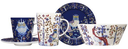
Of course, after all this questioning, I had to make an experiment and added new layers of colours to Frutti. Then, last Saturday I spotted this iittala window here in Stockholm and realised what a great example it is of translating a multicoloured pattern into a single colour print. In fact, I must say I was delighted to rediscover its lines and pure shapes beneath all the airbrushed colour. Taika was designed by Finnish artist Klaus Haapaniemi in 2007.

By the way, why did I mention 28 screens? Have a look at Jobs Handprinted Textiles, a Swedish company handprinting textiles up to 28 different colours. Wouldn't that be a dream?


